

30 years of life
Vanguard have recently updated one of my most used utilities, the 30 year index chart.
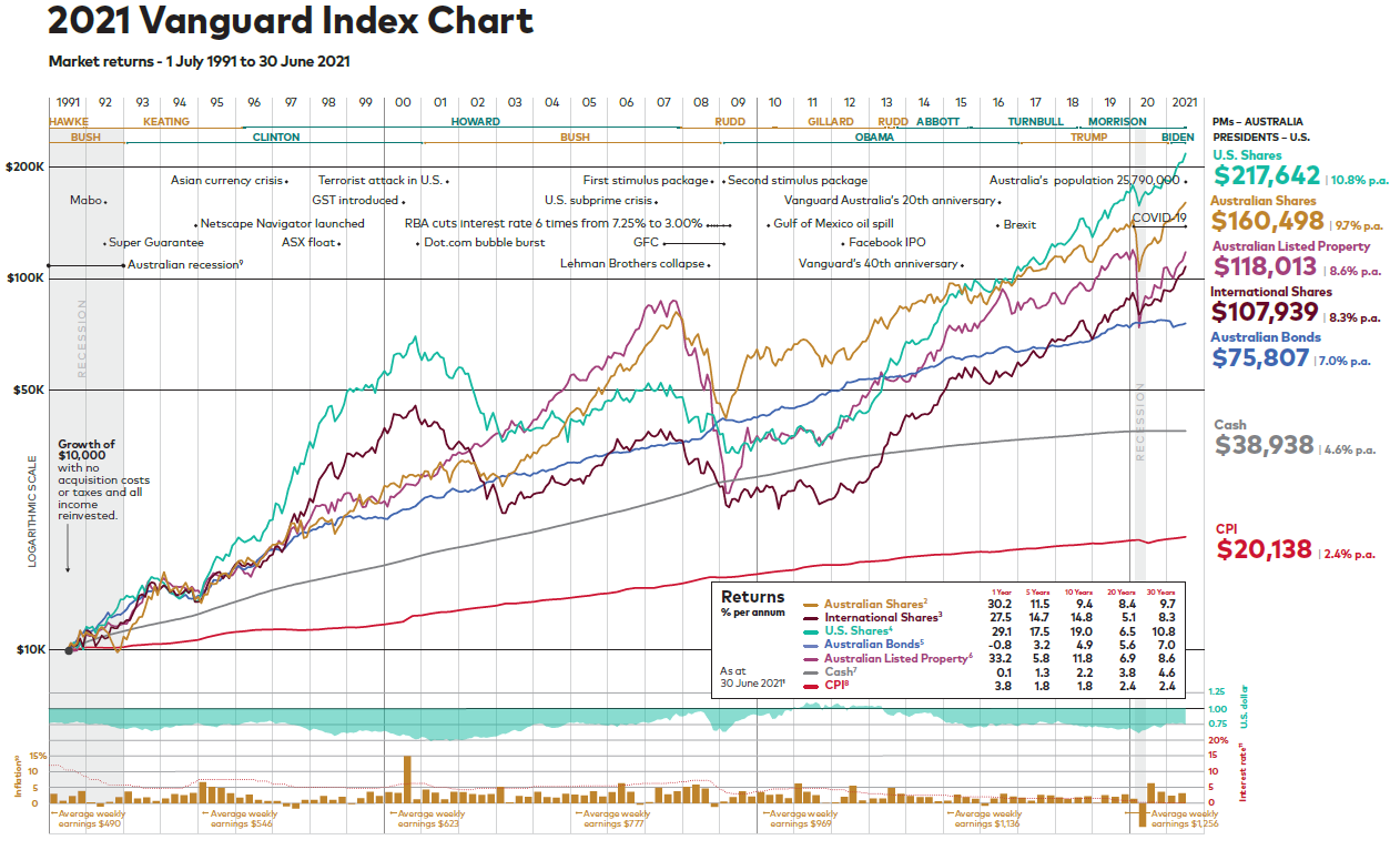
You can see a larger version of the chart by clicking the image above or HERE
The chart shows the return of a $10,000 investment over 30 years invested in different asset classes (nb: it doesn't take off platform or tax costs) while highlighting on this journey some of the key events along the way, the different leaderships both here and in the US as well as interest rates and the value of the dollar.
A lot of info in one picture - I have an A1 version on my wall in the office.
Thankfully Vanguard have also provided some additional explanation in an easy to read Brochure and also a short Video
A few trends and points of note from me:
Inflation is catching up with Cash - fast. Inflation (CPI) of 3.8% last year vs. Cash returns of 0.1% and also 1.8% vs. 103% over 5 years shows that cash is losing it's value. Unless you're spending your time hopping from bonus rate to bonus rate in cash accounts, you're losing spending power quickly.
Global diversification of shares beats everything. I've spoken before about the remarkable run in the last 10 years of US stocks - Apple, Google and all - but 2000-2010 is known as the lost decade for the US Markets. From a high before the tech crash, the US market spent ten years creeping down with a massive drop at the end from the GFC. It would have been incredibly tempting for a holder of US stocks to dump their portfolio along the way to seek higher returns. But the patient investor has been rewarded handsomely.
The markets don't care about the news. Other than major economic events, like a Covid shutdown, there is virtually no correlation to global stock markets. News channels try to convince us otherwise as scare stories get more clicks than good news stories.
